
The Psychology Of Colour: How Glass Splashbacks Can Influence Your Mood
Have you ever noticed how certain colours make you feel more relaxed or energised? This isn't just a coincidence; colour psychology plays a significant role in our daily lives. The kitchen, being one of the most used spaces in homes, can greatly benefit from thoughtful colour choices and glass splashbacks are an excellent way to introduce these hues. In this blog, we’ll explore the psychology of colour and help you choose the perfect splashback to create the desired atmosphere.
Understanding the Basics: How Colour Psychology Works
Colour psychology is the study of how colours affect human emotions and behaviours. Each colour can evoke specific feelings and responses, which is why the colours we choose for our living spaces are so important. For example, warm colours like red, orange and yellow can stimulate feelings of energy, warmth and happiness. In contrast, cool colours like blue, green and purple are known for their calming and relaxing effects. Recognising how various colours affect your mood can guide you in choosing the best hues for living spaces, especially busy areas like kitchens.
It’s also important to consider general colour psychology principles and how you respond to different hues. This can help you create an environment that is visually pleasing and emotionally supportive. For instance, while orange is often seen as enthusiastic and lively, it can also come across as overwhelming or aggressive if overused.
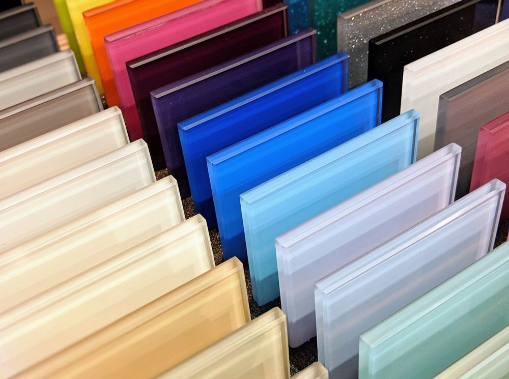
Choosing the Ideal Glass Splashback Colour for Kitchens
Choosing the right glass splashback colour for kitchens involves balancing aesthetic appeal with emotional impact. Here are some key considerations to help you make the perfect choice:
- Consider the Atmosphere: Decide on the mood you want to create—energetic, calming or sophisticated.
- Coordinate with Existing Decor: Ensure the colour complements the cabinets, countertops and appliances.
- Evaluate Lighting: Assess how lighting, both natural and artificial, affects the appearance of the colour.
- Think About Maintenance: Lighter colours might show stains more easily, while darker hues can hide them better.
- Test Samples: View colour samples at different times of the day to see how they look in various lighting conditions.
- Seek Advice: Consult with a glazier to get expert recommendations tailored to your project.
The Latest Trends in Glass Splashback Colours
As design trends evolve, so do the popular choices for glass splashback colours. Staying updated with the latest trends can help you make a stylish and contemporary choice.
Monochromatic Scheme
Using different shades of a single colour can create a cohesive and sophisticated look. This trend is popular because it maintains visual interest without overwhelming the space.
Bold Statement
Bright and bold colours like deep red and rich purple are making a comeback. These colours can help create a striking focal point, adding depth and character to the kitchen.
Neutral Tone
Neutral colours like white, grey and beige remain timeless choices. They provide a clean, modern look and can easily be complemented with colourful accessories. Neutrals also offer versatility, allowing you to change the room's look with minimal effort.
Find the Perfect Glass Splashbacks in Wollongong
At Langson Glass, our glaziers are dedicated to helping you choose the perfect glass splashback colour to create a positive and uplifting environment. Whether you want to energise a kitchen with vibrant hues or create a serene environment, we are here to bring your vision to life. We also offer glass replacement in Wollongong. Get in touch with our team today and explore our wide range of glass products!
SITE LINKS
GLASS PRODUCTS
CONTACT US
SOCIAL MEDIA


LICENSE
84135178602
TRADING HOURS
- Monday
- -
- Tuesday
- -
- Wednesday
- -
- Thursday
- -
- Friday
- -
- Saturday
- Closed
- Sunday
- Closed
24 hours Emergency Service
